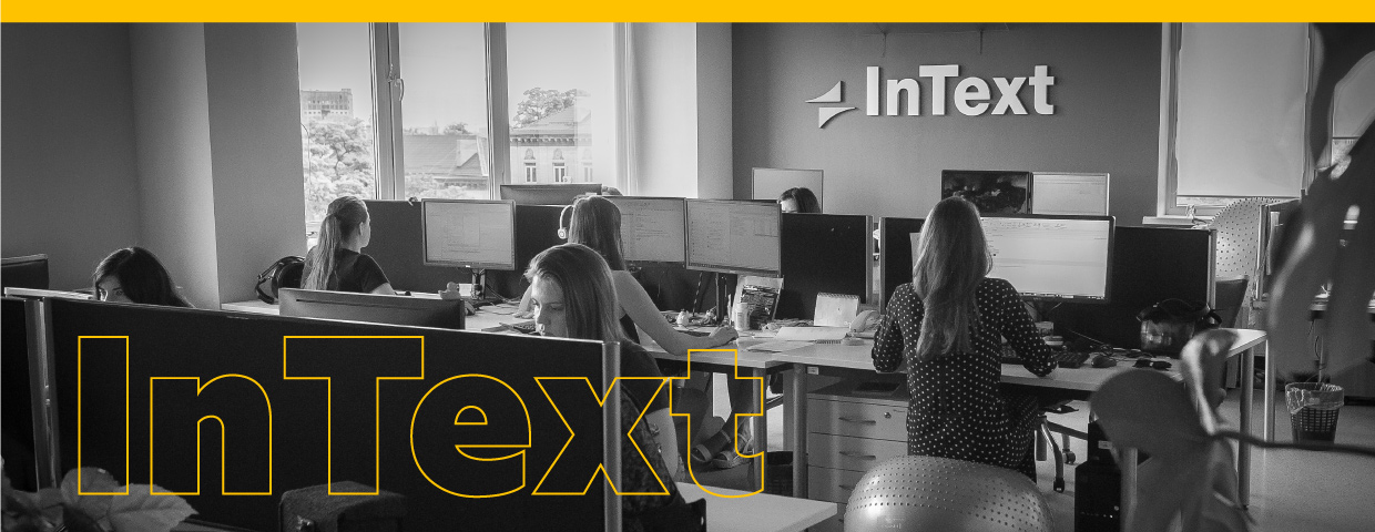
Nothing is set in stone, and at InText, we recently changed our style of visual communication by rebranding to create a consistent corporate identity.
Our first step was to refresh our logo. We needed to keep the brand idea while making the logo modern and in line with visual branding trends. The InText logo shows two pieces of paper in front of a rising sun, which signifies that translation is the key for our future. Here are the concepts we created to convey this meaning in a new form:
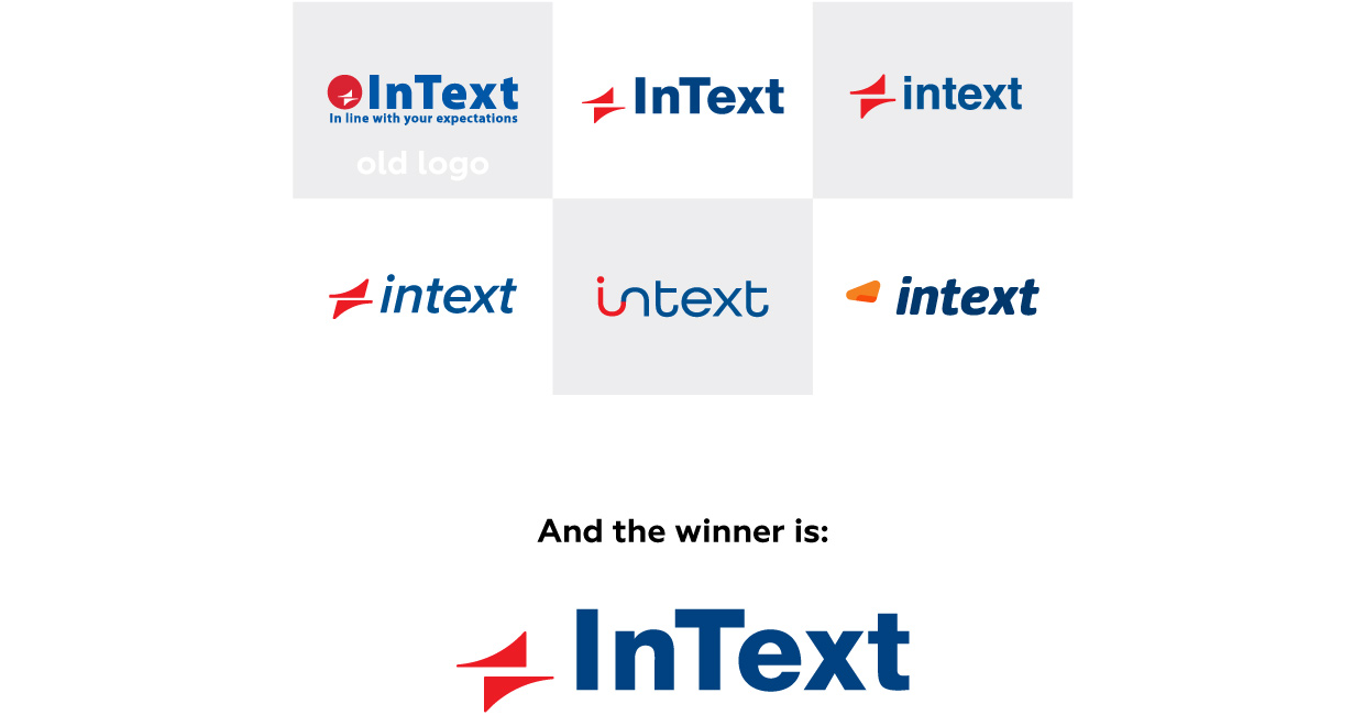
We took this simplified, light version of our logo as the basis for further identity changes. After we created it, we needed to integrate it into our corporate materials. While doing this, we chose additional corporate colors and a new primary brand font: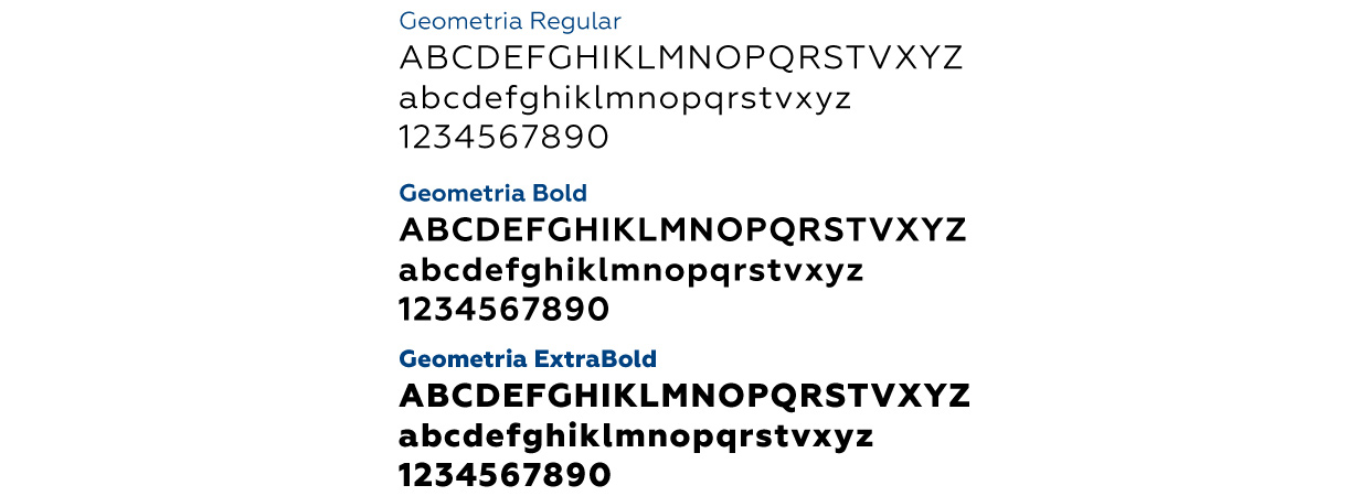
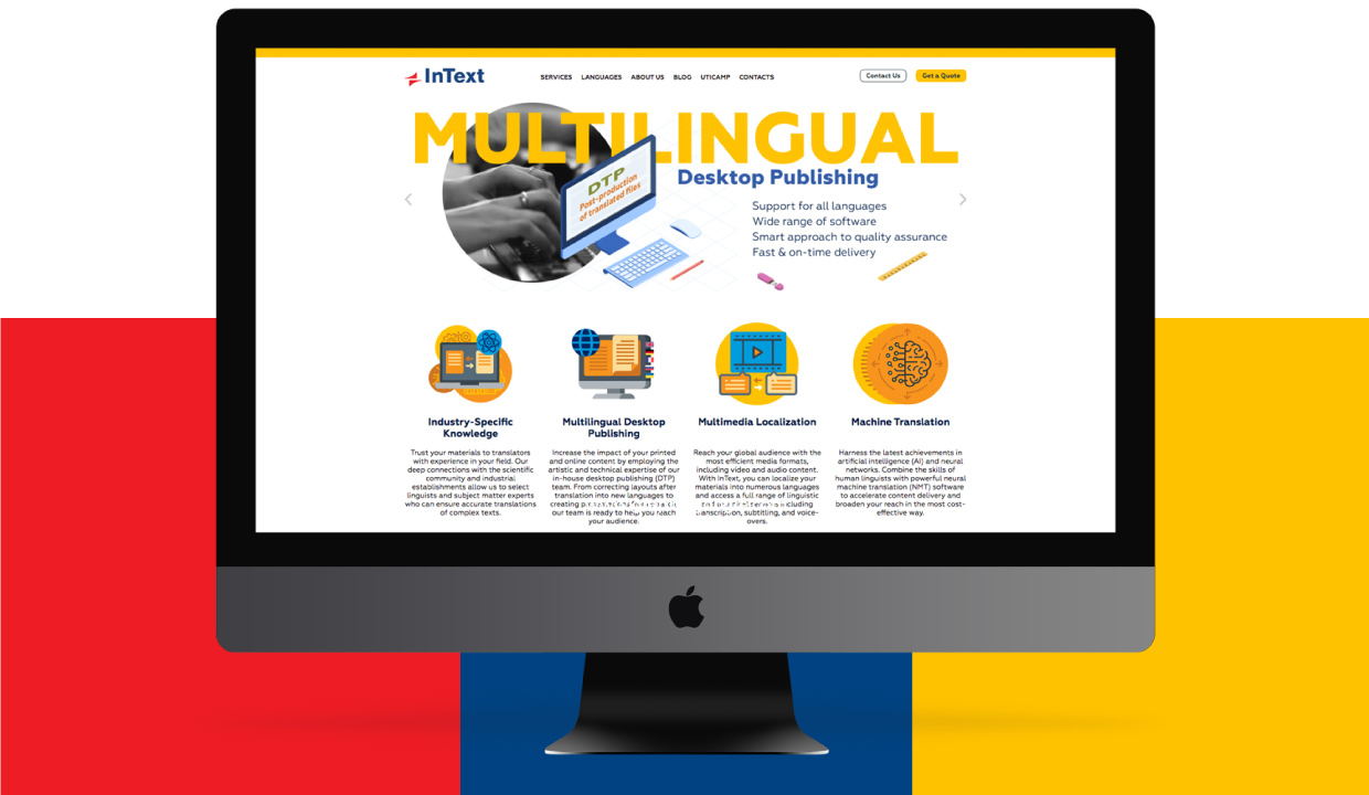
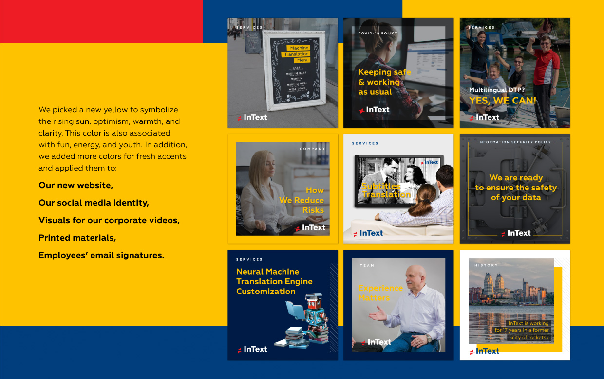
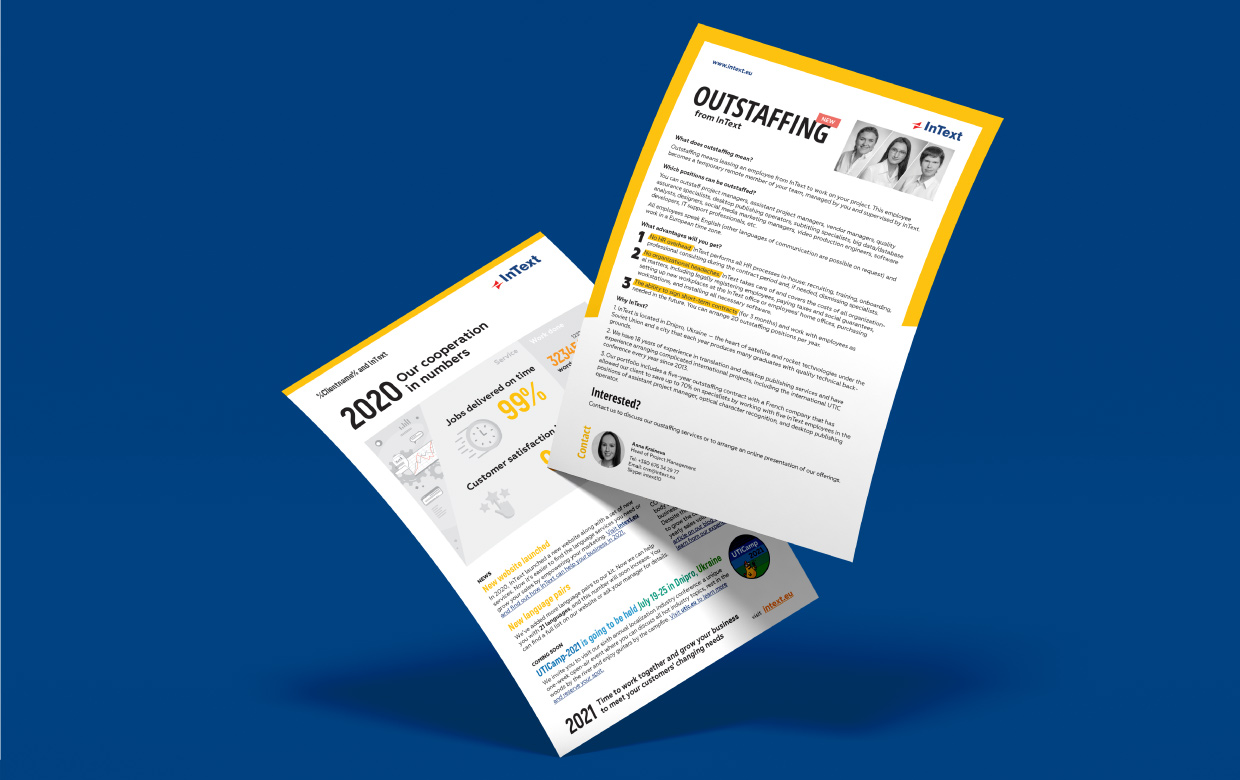
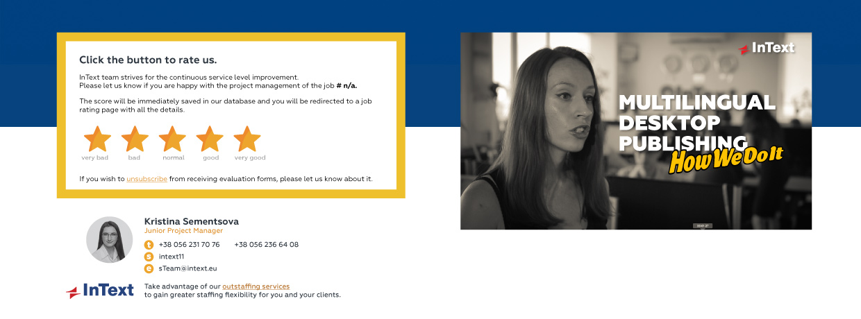 Consistency across visual materials helps the InText brand become eye-catching and recognizable. Meanwhile, the numerous templates we’ve created for different kinds of materials reduce the time and cost
for creating future content.
 If you’re looking to refresh your own brand, keep in mind that InText offers branding and rebranding services.